pacman::p_load(tmap, SpatialAcc, sf, ggstatsplot, reshape2, tidyverse, fca)In Class Exericse 10 Modelling Geographical Accessibility
Before we getting started, it is important for us to install the necessary R packages and launch them into RStudio environment.
The R packages need for this exercise are as follows:
Spatial data handling
- sf
Modelling geographical accessibility
- spatialAcc
Attribute data handling
- tidyverse, especially readr and dplyr
thematic mapping
- tmap
Staistical graphic
- ggplot2
Statistical analysis
- ggstatsplot
The code chunk below installs and launches these R packages into RStudio environment.
1. Getting started loading of R packages
2. Geospatial Data Wrangling
2.1 Importing Geospatial Data
mpsz <- st_read(dsn = "Data/Geospatial", layer = "MP14_SUBZONE_NO_SEA_PL")Reading layer `MP14_SUBZONE_NO_SEA_PL' from data source
`C:\Users\kwekm\Desktop\SMU Year 3 Semester 2\IS415 Geospatial Analytics and Applications\KMRCrazyDuck\IS415-KMR\In-class_Ex\Data\Geospatial'
using driver `ESRI Shapefile'
Simple feature collection with 323 features and 15 fields
Geometry type: MULTIPOLYGON
Dimension: XY
Bounding box: xmin: 2667.538 ymin: 15748.72 xmax: 56396.44 ymax: 50256.33
Projected CRS: SVY21hexagons <- st_read(dsn = "Data/Geospatial", layer = "hexagons") Reading layer `hexagons' from data source
`C:\Users\kwekm\Desktop\SMU Year 3 Semester 2\IS415 Geospatial Analytics and Applications\KMRCrazyDuck\IS415-KMR\In-class_Ex\Data\Geospatial'
using driver `ESRI Shapefile'
Simple feature collection with 3125 features and 6 fields
Geometry type: POLYGON
Dimension: XY
Bounding box: xmin: 2667.538 ymin: 21506.33 xmax: 50010.26 ymax: 50256.33
Projected CRS: SVY21 / Singapore TMeldercare <- st_read(dsn = "Data/Geospatial", layer = "ELDERCARE") Reading layer `ELDERCARE' from data source
`C:\Users\kwekm\Desktop\SMU Year 3 Semester 2\IS415 Geospatial Analytics and Applications\KMRCrazyDuck\IS415-KMR\In-class_Ex\Data\Geospatial'
using driver `ESRI Shapefile'
Simple feature collection with 120 features and 19 fields
Geometry type: POINT
Dimension: XY
Bounding box: xmin: 14481.92 ymin: 28218.43 xmax: 41665.14 ymax: 46804.9
Projected CRS: SVY21 / Singapore TM2.2 Update CRS information
mpsz <- st_transform(mpsz, 3414)
eldercare <- st_transform(eldercare, 3414)
hexagons <- st_transform(hexagons, 3414)
2.3 Cleaning and updating attributes fields of geospatial data
eldercare <- eldercare %>%
  select(fid, ADDRESSPOS) %>%
  mutate(capacity = 100)

hexagons <- hexagons %>%
  select(fid) %>%
  mutate(demand = 100)
3. Aspatial Data Handling and Wrangling
The code chunk below uses read_cvs() of readr package to import OD_Matrix.csv into RStudio. The imported object is a tibble data.frame called ODMatrix.
ODMatrix <- read_csv("Data/Aspatial/OD_Matrix.csv", skip = 0)distmat <- ODMatrix %>%
select(origin_id, destination_id, total_cost) %>%
spread(destination_id, total_cost)%>%
select(c(-c('origin_id')))distmat_km <- as.matrix(distmat/1000)Computing Distance Matrix (Optional)
#eldercare_coord <- st_coordinates(eldercare_coord)
#hexagon_coord <- st_coordinates(hexagon)
#EucMatrix <- Spatial::distance(hexagon_coord, eldercare_coord,type = "euclidean")4. Modeling and Visualising using Hansen Method
4.1 Computing Hansen’s accessbility
Now, we ready to compute Hansen’s accessibility by using ac() of SpatialAcc package. Before getting started, you are encourage to read the arguments of the function at least once in order to ensure that the required inputs are available.
The code chunk below calculates Hansen’s accessibility using ac() of SpatialAcc and data.frame() is used to save the output in a data frame called acc_Handsen.
acc_Hansen <- data.frame(ac(hexagons$demand,
                            eldercare$capacity,
                            distmat_km,
                            #d0 = 50,
                            power = 2,
                            family = "Hansen"))
The default field name is very messy, we will rename it to accHansen by using the code chunk below.
colnames(acc_Hansen) <- "accHansen"Next, we will convert the data table into tibble format by using the code chunk below.
acc_Hansen <- tbl_df(acc_Hansen)Lastly, bind_cols() of dplyr will be used to join the acc_Hansen tibble data frame with the hexagons simple feature data frame. The output is called hexagon_Hansen.
hexagon_Hansen <- bind_cols(hexagons, acc_Hansen)Notice that hexagon_Hansen is a simple feature data frame and not a typical tibble data frame.
Actually, the steps above can be perform by using a single code chunk as shown below.
acc_Hansen <- data.frame(ac(hexagons$demand,
                            eldercare$capacity,
                            distmat_km,
                            #d0 = 50,
                            power = 0.5,
                            family = "Hansen"))

colnames(acc_Hansen) <- "accHansen"
acc_Hansen <- tbl_df(acc_Hansen)
hexagon_Hansen <- bind_cols(hexagons, acc_Hansen)
5. Visualising Hansen’s accessibility
5.1 Extracting map extend
Firstly, we will extract the extend of hexagons simple feature data frame by by using st_bbox() of sf package.
mapex <- st_bbox(hexagons)The code chunk below uses a collection of mapping fucntions of tmap package to create a high cartographic quality accessibility to eldercare centre in Singapore.
tmap_mode("plot")
tm_shape(hexagon_Hansen,
         bbox = mapex) +
  tm_fill(col = "accHansen",
          n = 10,
          style = "quantile",
          border.col = "black",
          border.lwd = 1) +
tm_shape(eldercare) +
  tm_symbols(size = 0.1) +
  tm_layout(main.title = "Accessibility to eldercare: Hansen method",
            main.title.position = "center",
            main.title.size = 2,
            legend.outside = FALSE,
            legend.height = 0.45,
            legend.width = 3.0,
            legend.format = list(digits = 6),
            legend.position = c("right", "top"),
            frame = TRUE) +
  tm_compass(type="8star", size = 2) +
  tm_scale_bar(width = 0.15) +
  tm_grid(lwd = 0.1, alpha = 0.5)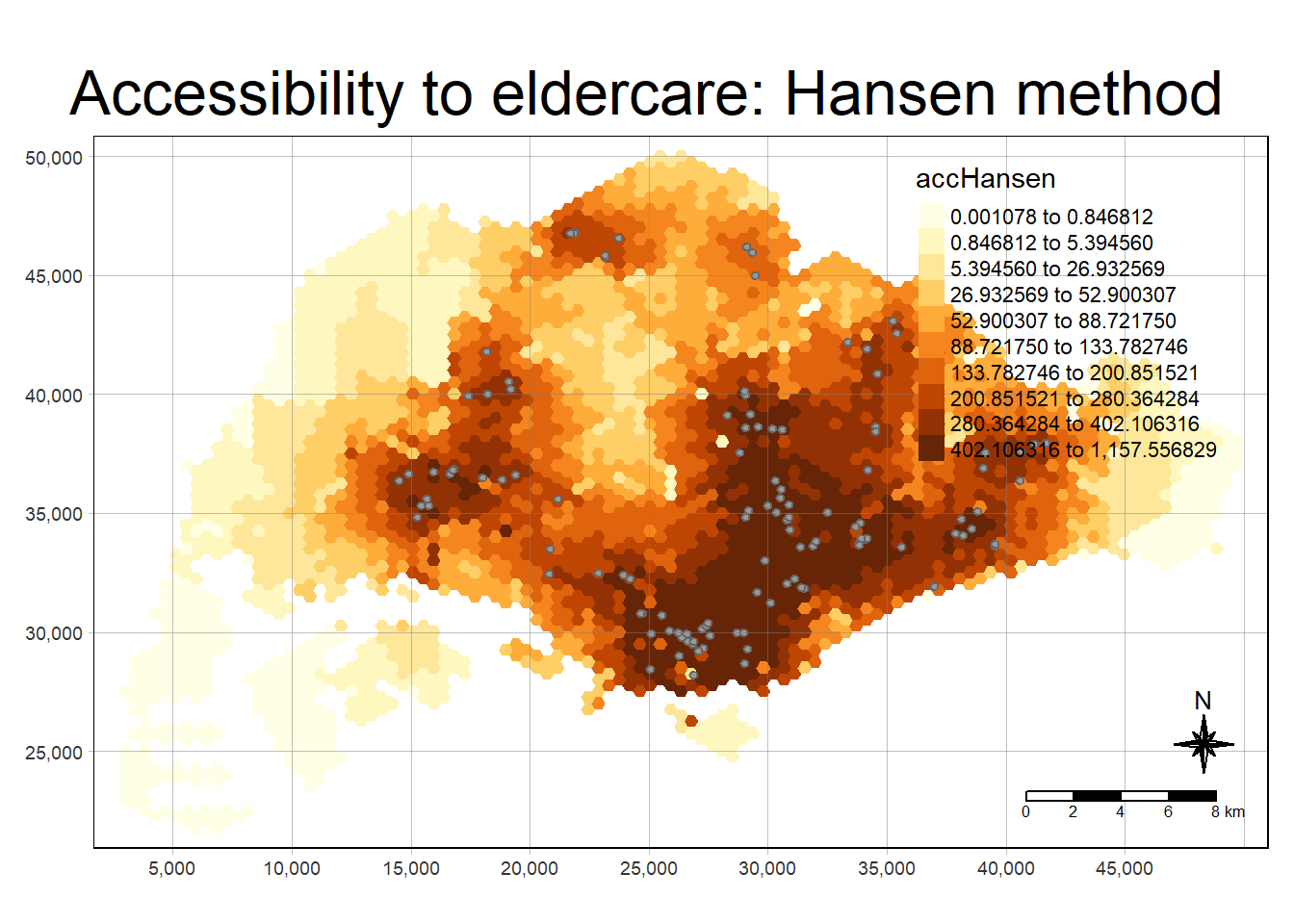
5.2 Statistical graphical visualisation
In this section, we are going to compare the distribution of Hansen’s accessibility values by URA Planning Region.
Firstly, we need to add the planning region field into haxegon_Hansen simple feature data frame by using the code chunk below.
hexagon_Hansen <- st_join(hexagon_Hansen, mpsz,
                          join = st_intersects)
Next, ggplot() will be used to plot the distribution by using boxplot graphical method.
ggplot(data=hexagon_Hansen,
       aes(y = log(accHansen),
           x= REGION_N)) +
  geom_boxplot() +
  geom_point(stat="summary",
             fun.y="mean",
             colour ="red",
             size=2)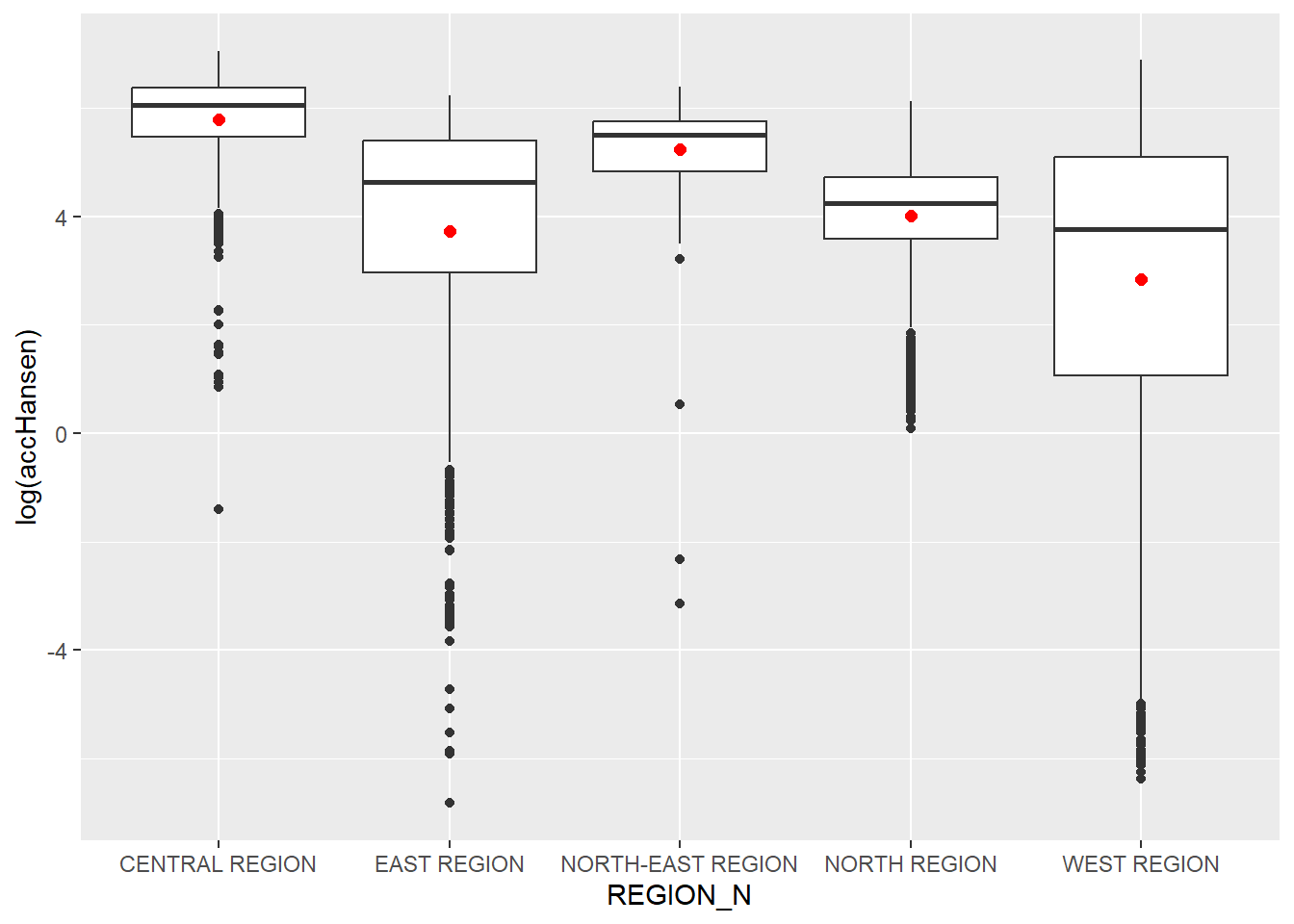
6. Modelling and Visualising Accessibility using KD2SFCA Method
6.1 Computing KD2SFCA’s accessibility
In this section, you are going to repeat most of the steps you had learned in previous section to perform the analysis. However, some of the codes will be combined into one code chunk. The code chunk below calculates Hansen’s accessibility using ac() of SpatialAcc and data.frame() is used to save the output in a data frame called acc_KD2SFCA. Notice that KD2SFCA is used for family argument.
acc_KD2SFCA <- data.frame(ac(hexagons$demand,
                            eldercare$capacity,
                            distmat_km,
                            d0 = 50,
                            power = 2,
                            family = "KD2SFCA"))

colnames(acc_KD2SFCA) <- "accKD2SFCA"
acc_KD2SFCA <- tbl_df(acc_KD2SFCA)
hexagon_KD2SFCA <- bind_cols(hexagons, acc_KD2SFCA)
6.2 Visualising KD2SFCA’s accessibility
The code chunk below uses a collection of mapping fucntions of tmap package to create a high cartographic quality accessibility to eldercare centre in Singapore. Notice that mapex is reused for bbox argument.
tmap_mode("plot")
tm_shape(hexagon_KD2SFCA,
         bbox = mapex) +
  tm_fill(col = "accKD2SFCA",
          n = 10,
          style = "quantile",
          border.col = "black",
          border.lwd = 1) +
tm_shape(eldercare) +
  tm_symbols(size = 0.1) +
  tm_layout(main.title = "Accessibility to eldercare: KD2SFCA method",
            main.title.position = "center",
            main.title.size = 2,
            legend.outside = FALSE,
            legend.height = 0.45,
            legend.width = 3.0,
            legend.format = list(digits = 6),
            legend.position = c("right", "top"),
            frame = TRUE) +
  tm_compass(type="8star", size = 2) +
  tm_scale_bar(width = 0.15) +
  tm_grid(lwd = 0.1, alpha = 0.5)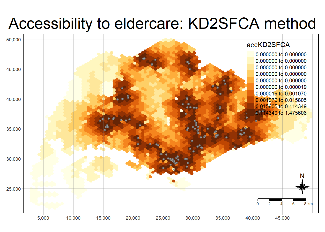
6.3 Statistical Graphical Visualisation
Now, we are going to compare the distribution of KD2CFA accessibility values by URA Planning Region.
Firstly, we need to add the planning region field into hexagon_KD2SFCA simple feature data frame by using the code chunk below.
hexagon_KD2SFCA <- st_join(hexagon_KD2SFCA, mpsz,
                          join = st_intersects)
Next, ggplot() will be used to plot the distribution by using boxplot graphical method.
ggplot(data=hexagon_KD2SFCA,
       aes(y = accKD2SFCA,
           x= REGION_N)) +
  geom_boxplot() +
  geom_point(stat="summary",
             fun.y="mean",
             colour ="red",
             size=2)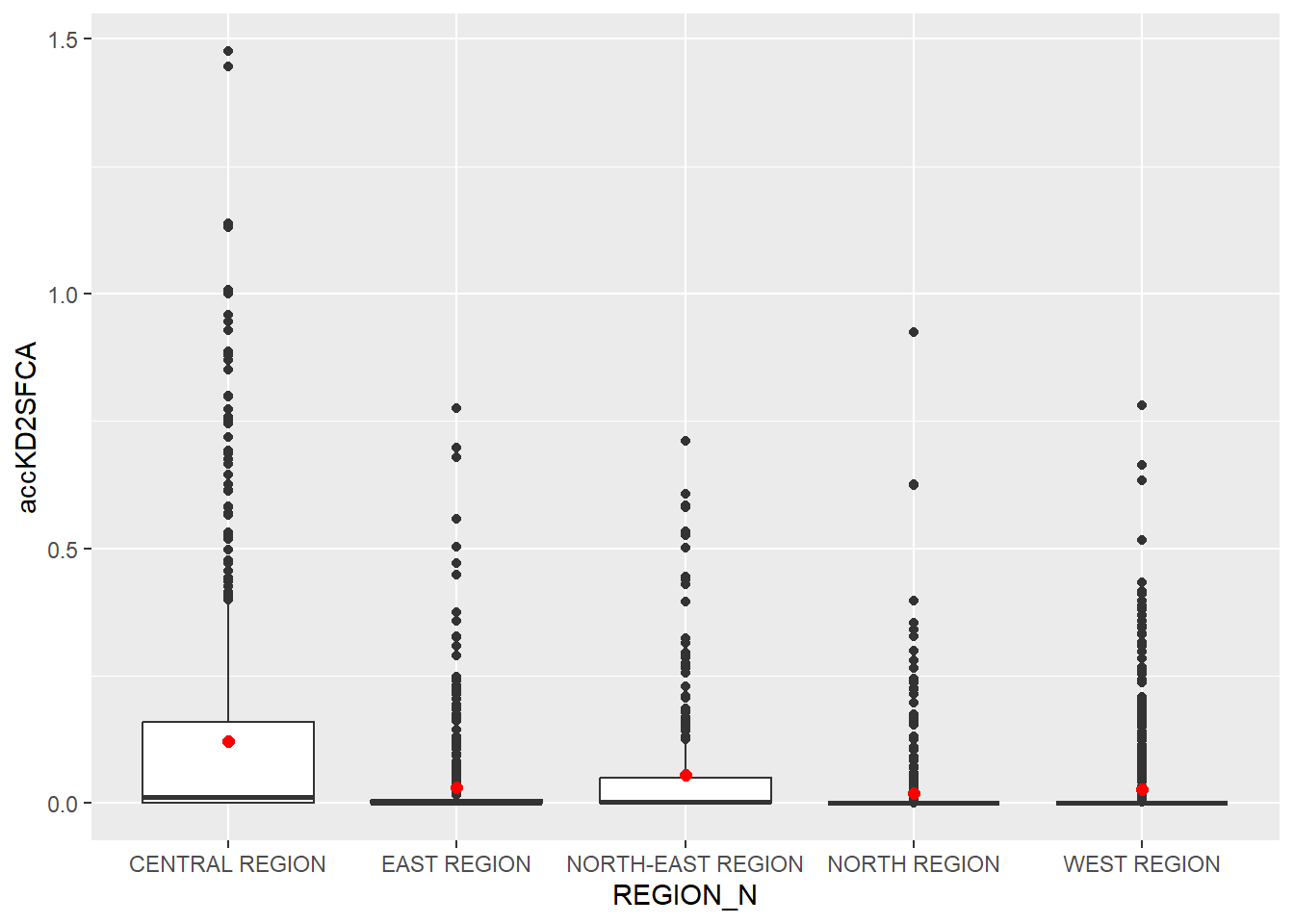
7. Modelling and Visualising using Spatial Accessibility Measure (SAM) method
7.1 Computing SAM accessibility
In this section, you are going to repeat most of the steps you had learned in previous section to perform the analysis. However, some of the codes will be combined into one code chunk. The code chunk below calculates Hansen’s accessibility using ac() of SpatialAcc and data.frame() is used to save the output in a data frame called acc_SAM. Notice that SAM is used for family argument.
acc_SAM <- data.frame(ac(hexagons$demand,
                         eldercare$capacity,
                         distmat_km,
                         d0 = 50,
                         power = 2,
                         family = "SAM"))

colnames(acc_SAM) <- "accSAM"
acc_SAM <- tbl_df(acc_SAM)
hexagon_SAM <- bind_cols(hexagons, acc_SAM)
7.2 Visualising SAM accessibilty
The code chunk below uses a collection of mapping fucntions of tmap package to create a high cartographic quality accessibility to eldercare centre in Singapore. Notice that mapex is reused for bbox argument.
tmap_mode("plot")
tm_shape(hexagon_SAM,
         bbox = mapex) +
  tm_fill(col = "accSAM",
          n = 10,
          style = "quantile",
          border.col = "black",
          border.lwd = 1) +
tm_shape(eldercare) +
  tm_symbols(size = 0.1) +
  tm_layout(main.title = "Accessibility to eldercare: SAM method",
            main.title.position = "center",
            main.title.size = 2,
            legend.outside = FALSE,
            legend.height = 0.45,
            legend.width = 3.0,
            legend.format = list(digits = 3),
            legend.position = c("right", "top"),
            frame = TRUE) +
  tm_compass(type="8star", size = 2) +
  tm_scale_bar(width = 0.15) +
  tm_grid(lwd = 0.1, alpha = 0.5)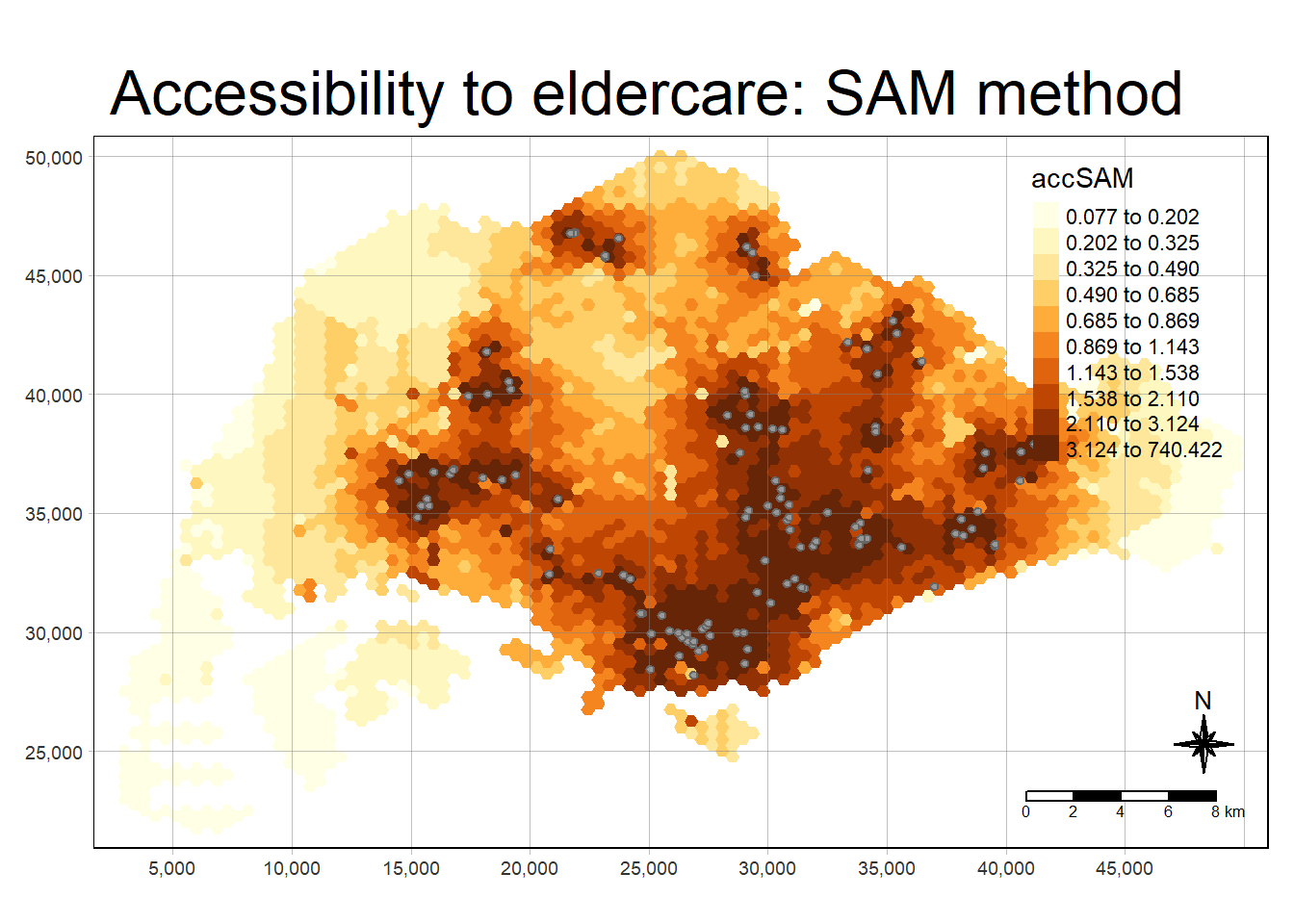
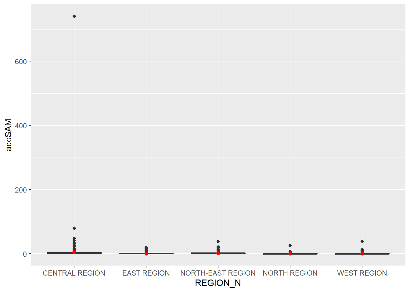
7.3 Statistical Graphical Visualisation
Now, we are going to compare the distribution of SAM accessibility values by URA Planning Region.
Firstly, we need to add the planning region field into hexagon_SAM simple feature data frame by using the code chunk below.
hexagon_SAM <- st_join(hexagon_SAM, mpsz,
                       join = st_intersects)
Next, ggplot() will be used to plot the distribution by using boxplot graphical method.
ggplot(data=hexagon_SAM,
       aes(y = accSAM,
           x= REGION_N)) +
  geom_boxplot() +
  geom_point(stat="summary",
             fun.y="mean",
             colour ="red",
             size=2)